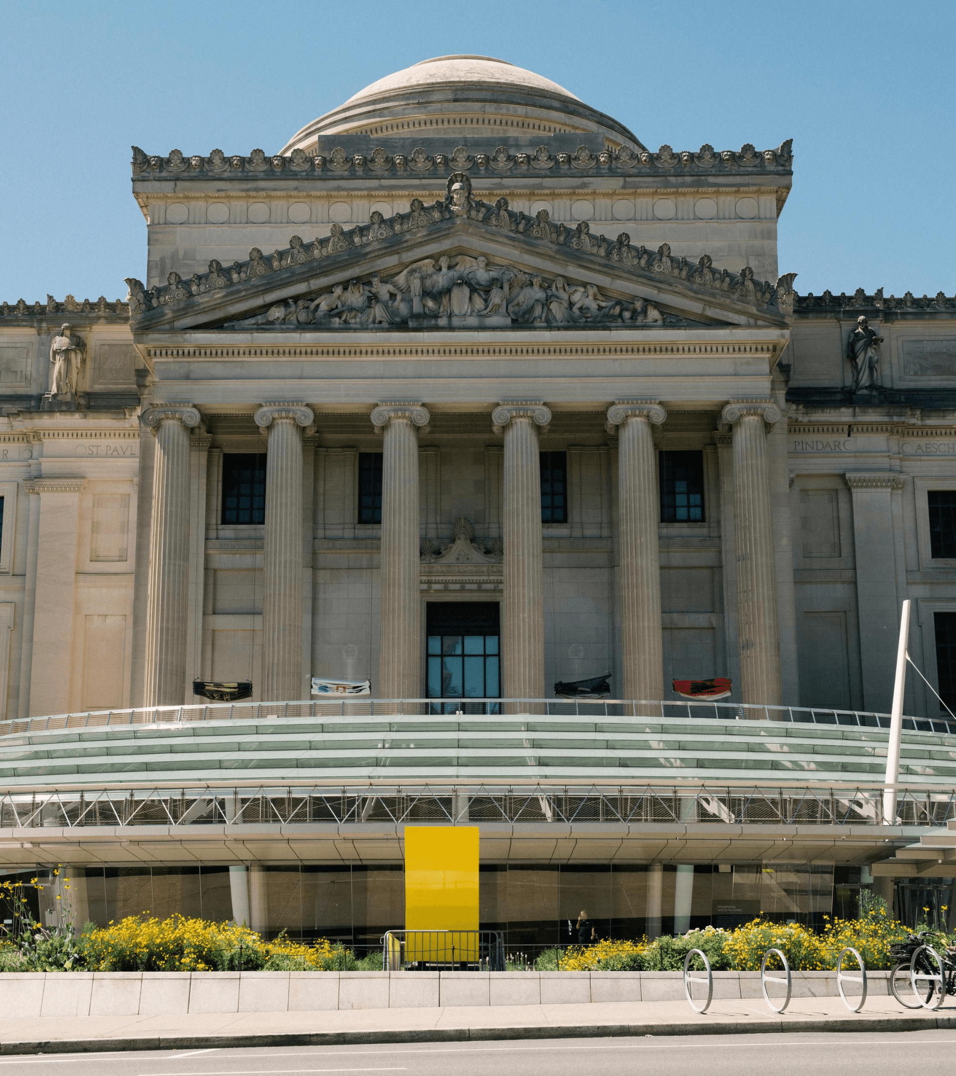
Brooklyn Museum
A reimagined website for the People's Museum, built around fostering deeper, ongoing connections, both onsite and online.
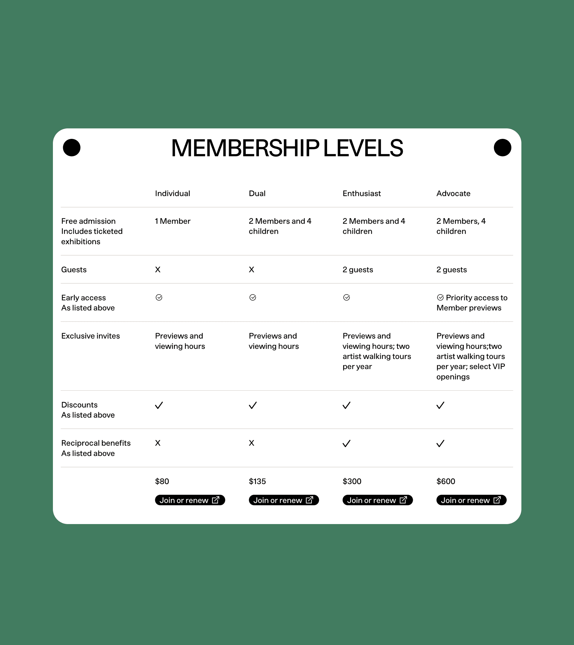
Brief
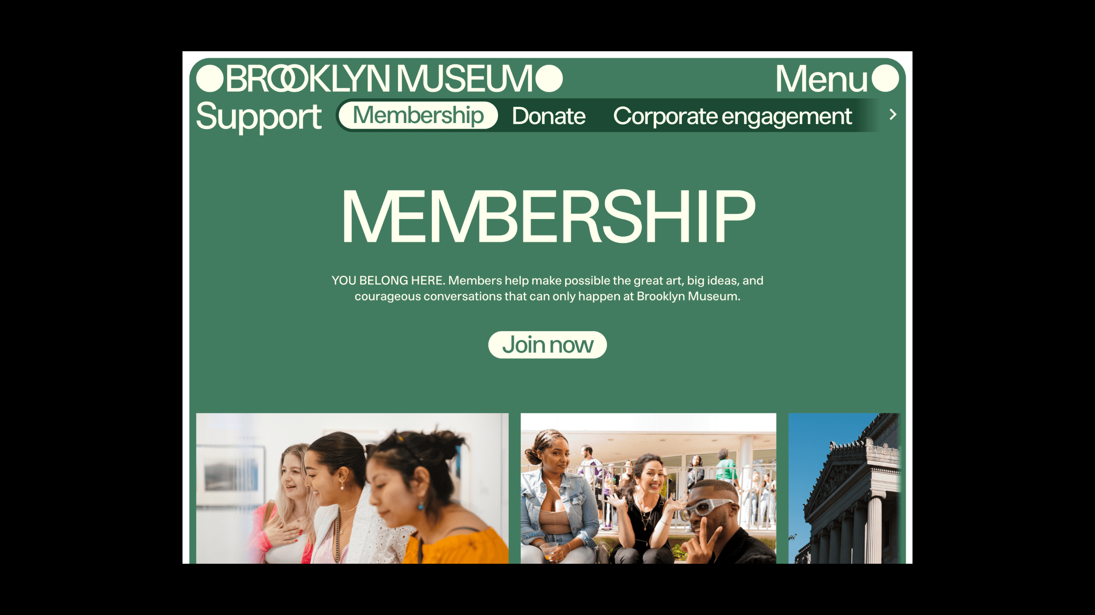
In an era where digital and physical experiences are more intertwined than ever, the design and build of this site was an opportunity for the museum to foster more meaningful relationships with a broad range of visitors, both within its walls and beyond, while strengthening its core revenue streams of ticketing and membership.
Solution
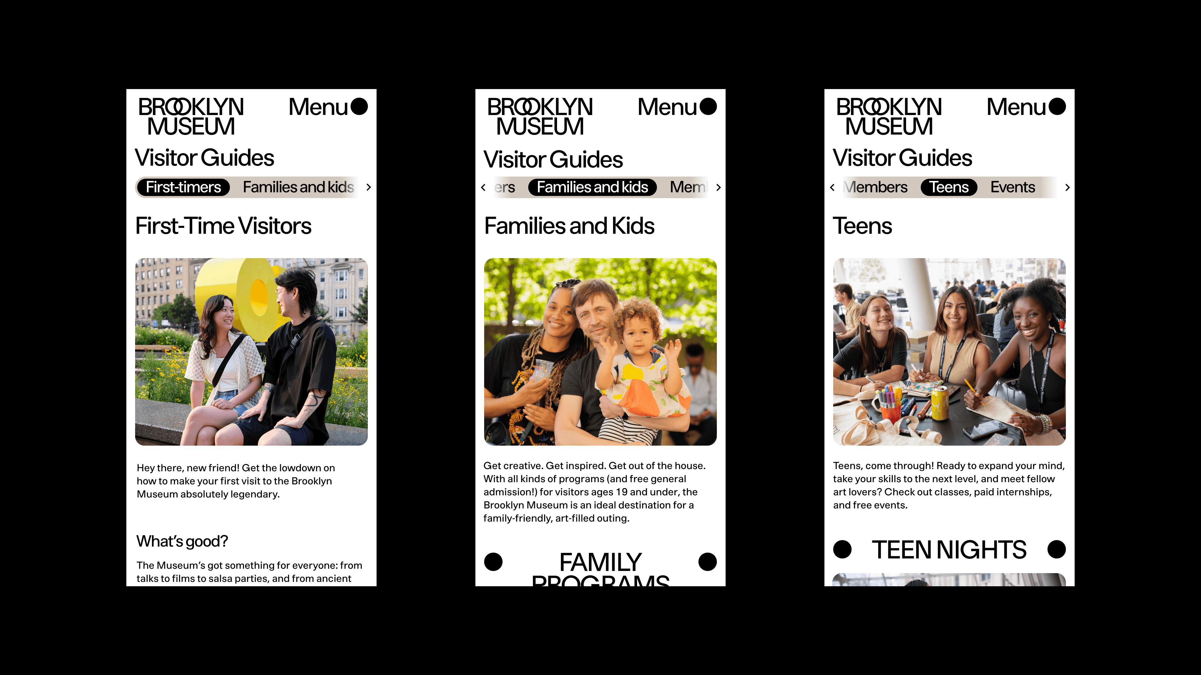
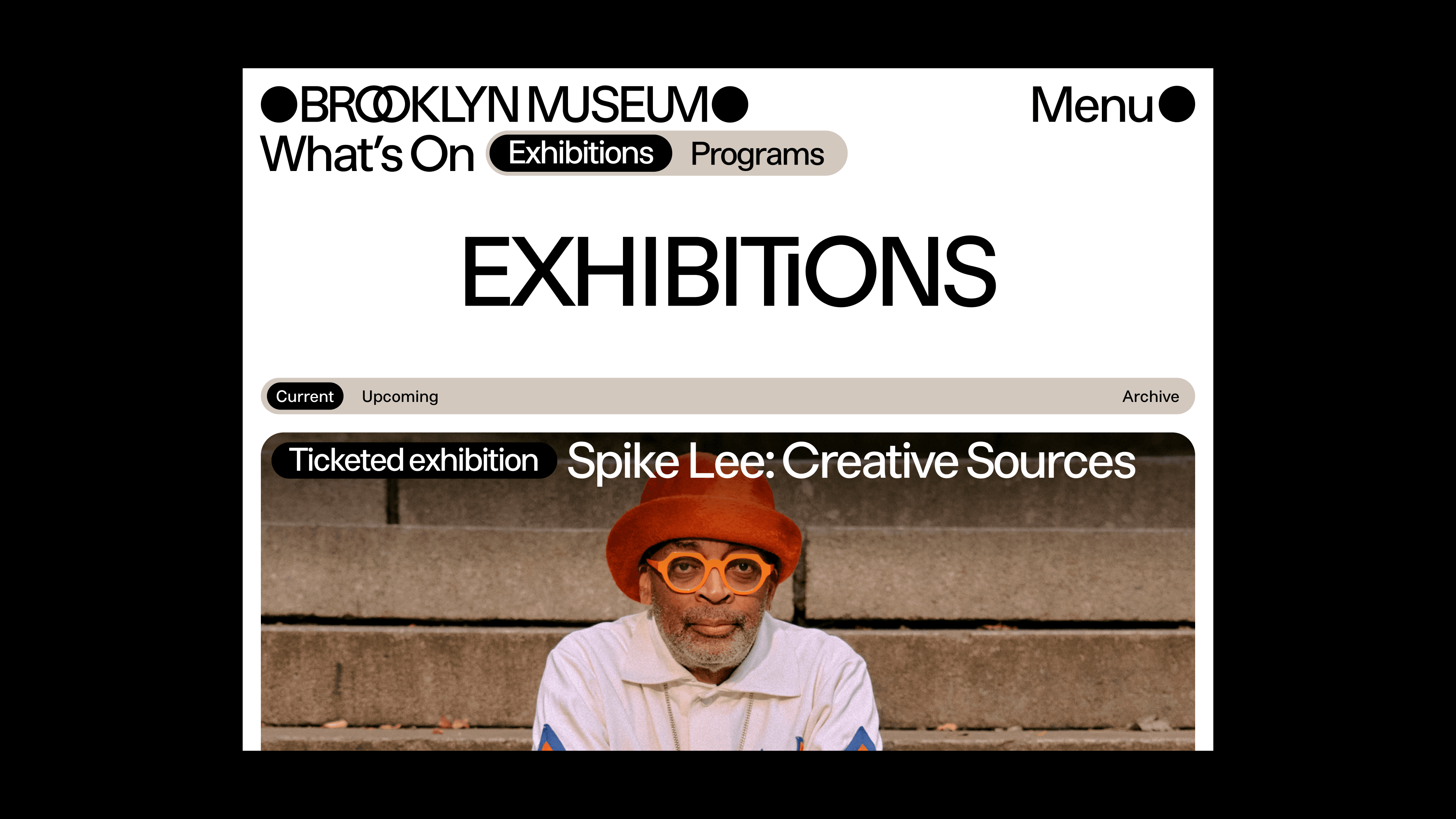
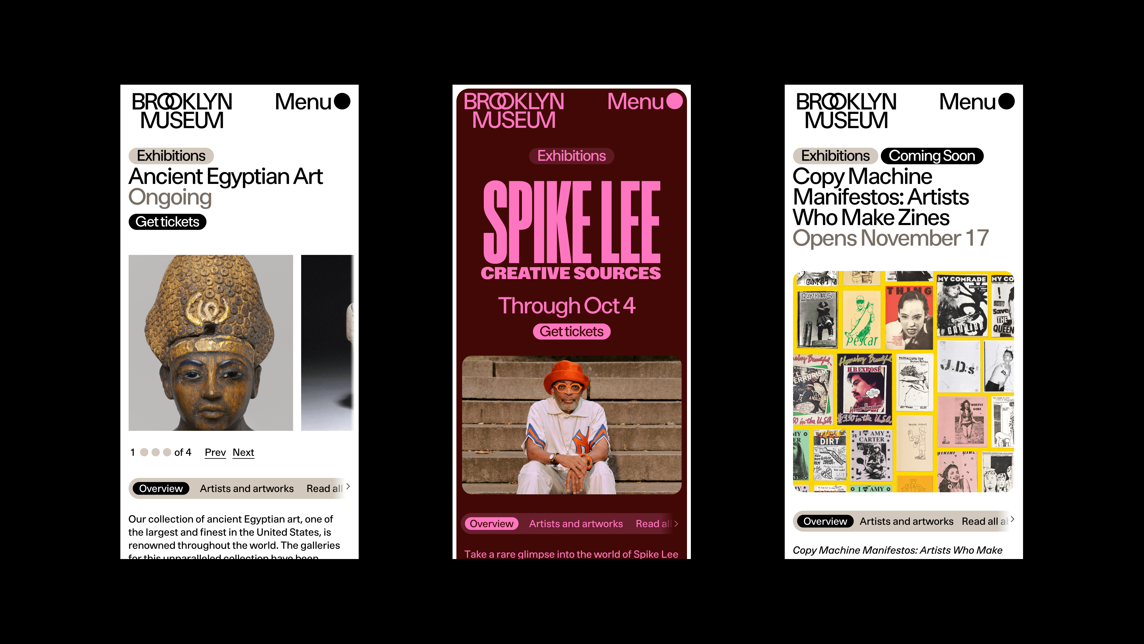
Building on its reputation as the “People’s Museum,” we designed and built a digital platform around deeper, ongoing connections, both onsite and online. We collaborated tightly with the museum's staff, brand design studio, and accessibility partners, to prioritize easy ways to discover and attend exhibitions and events, a tightly integrated collection, and a flexible system of informational program pages. All these elements create an interconnected content ecosystem that offers new pathways for exploration across previously disparate parts of the Museum’s offerings.
Working with visitor experience, marketing, and engagement teams to understand the Brooklyn Museum's unique angle on art and art experiences, we built flexible tools to communicate with audiences, punctured with visual moments that build anticipation for flagship events and give the Museum a dynamic, live presence.
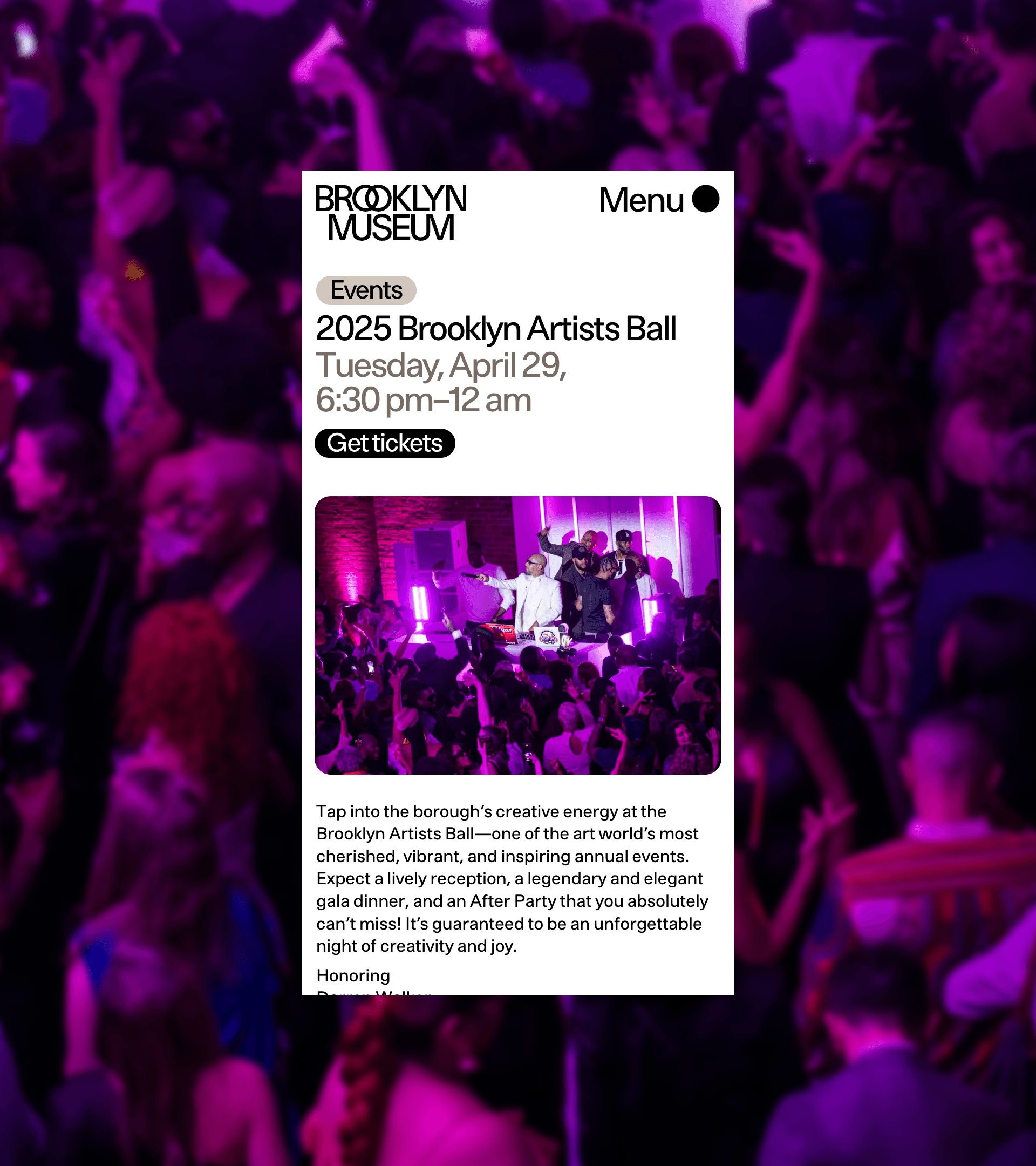
Core pathways to learn about and attend exhibitions and programs remained central to the Museum's engagement and revenue goals for the site.
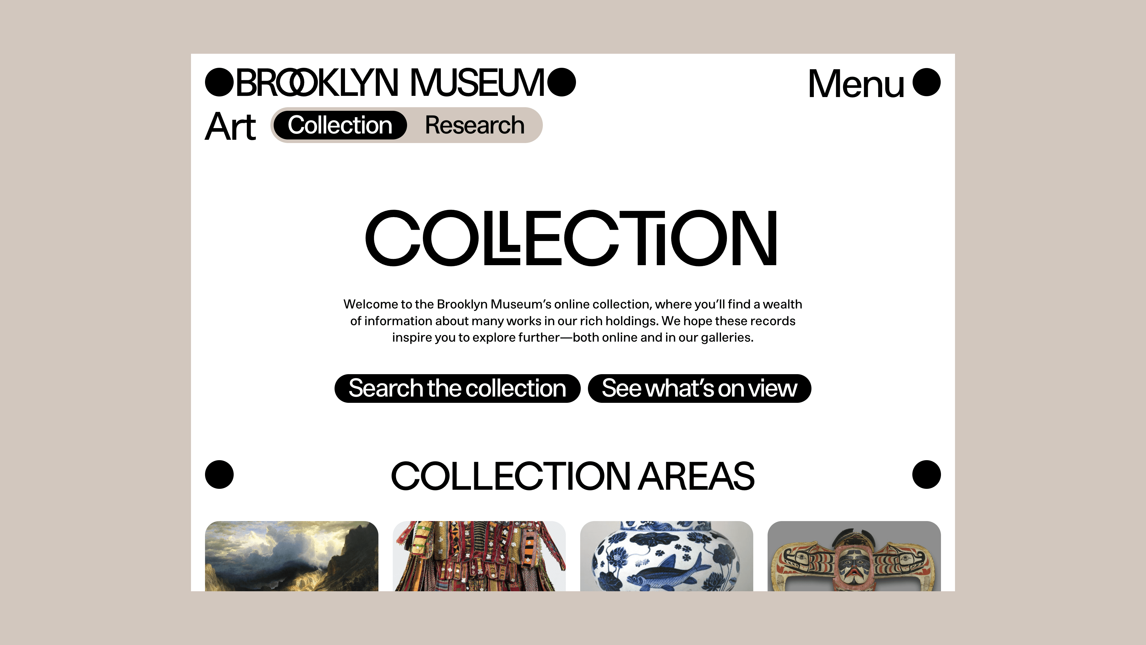
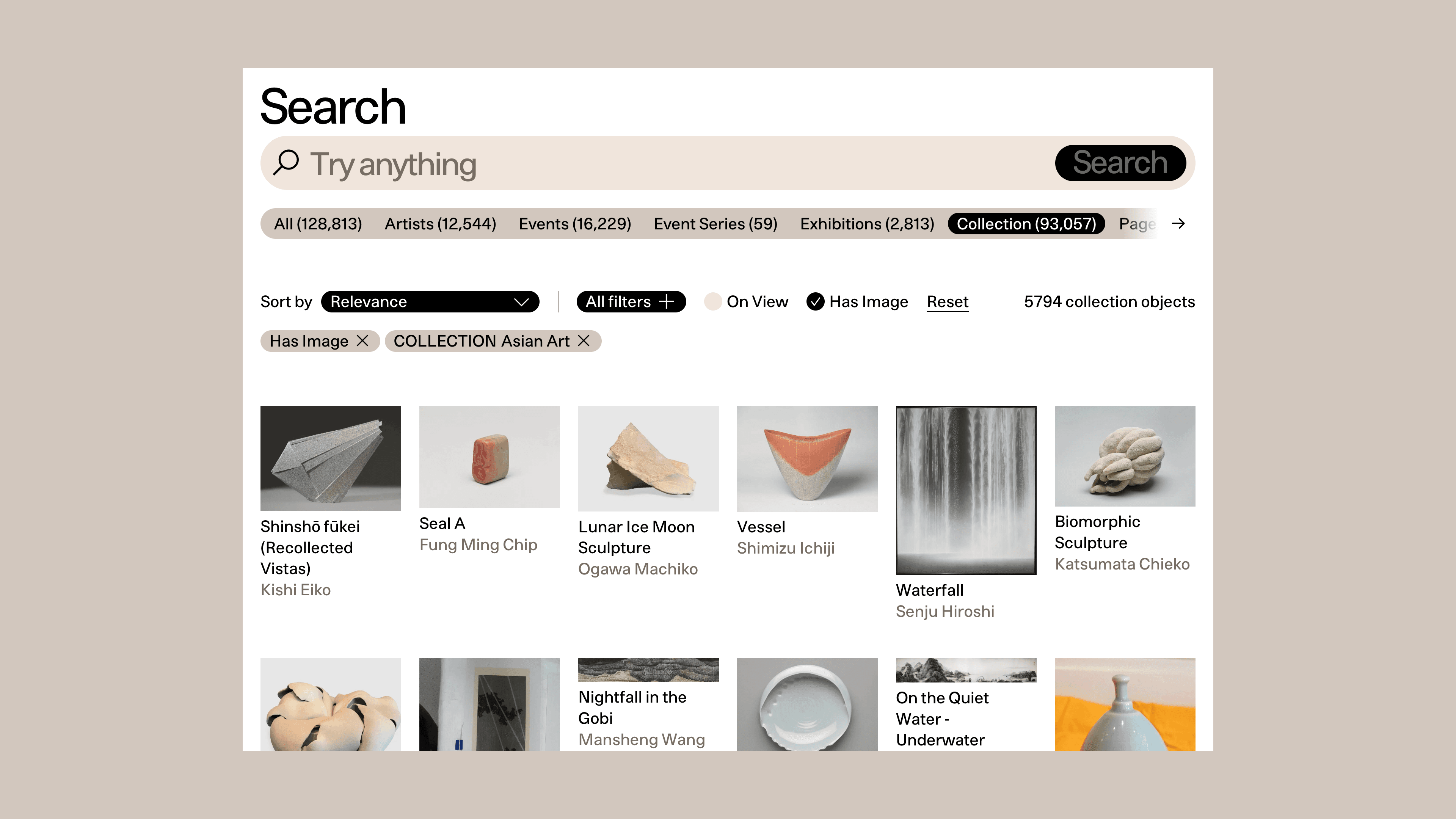
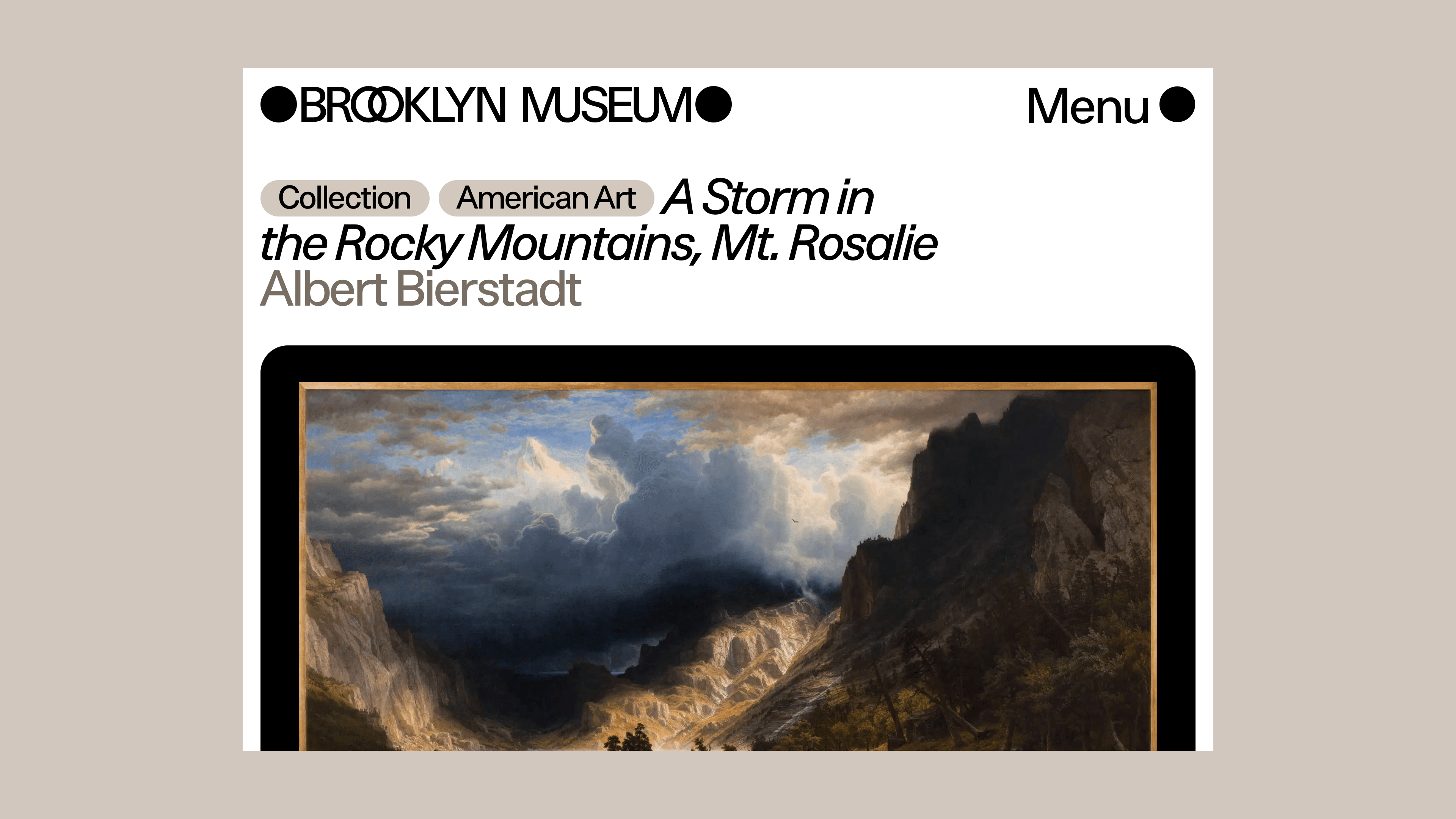
A deep integration with the collection management system TMS allows both art historians and the merely art-curious alike to feed their curiosity or strengthen their research.
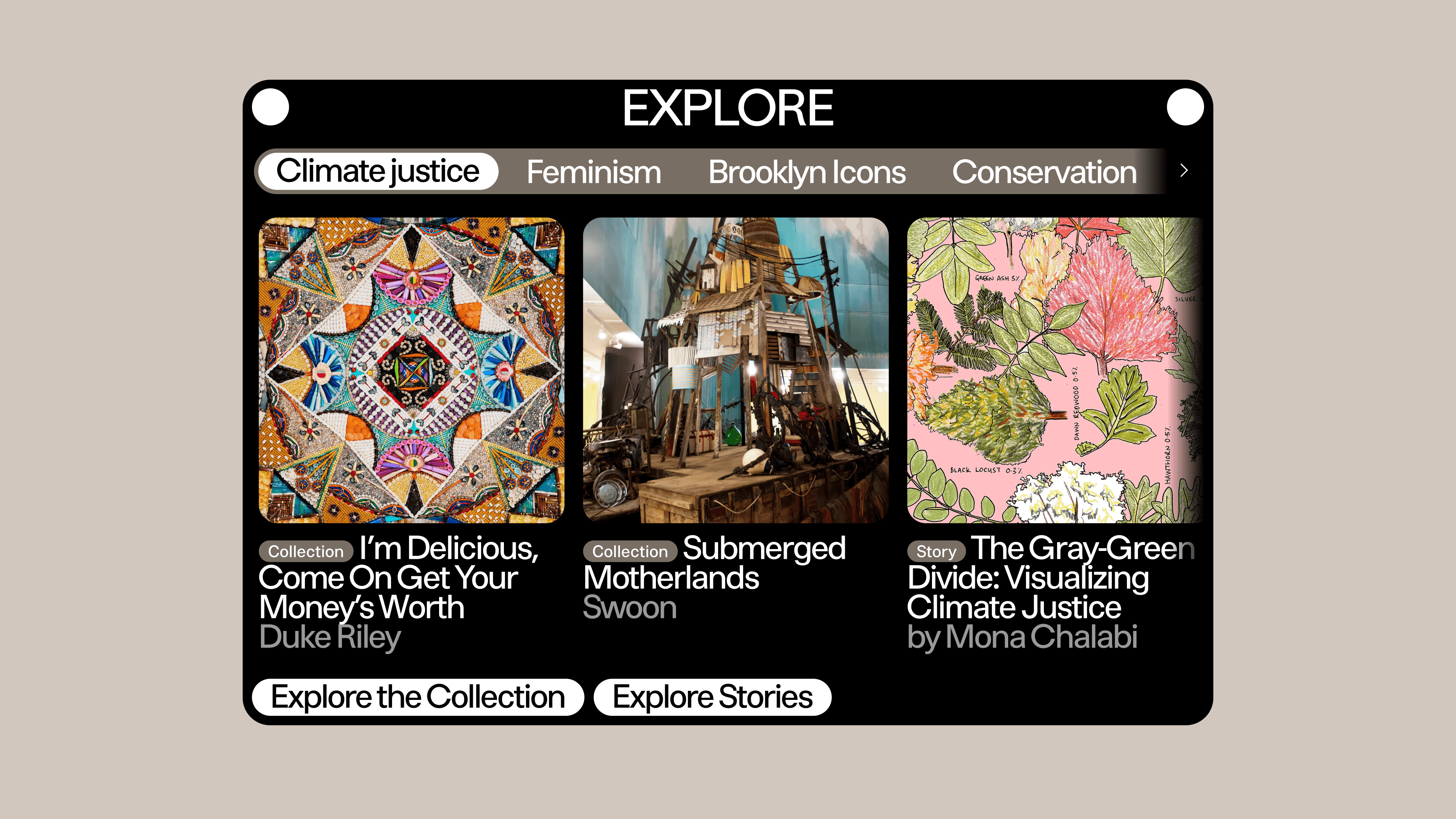
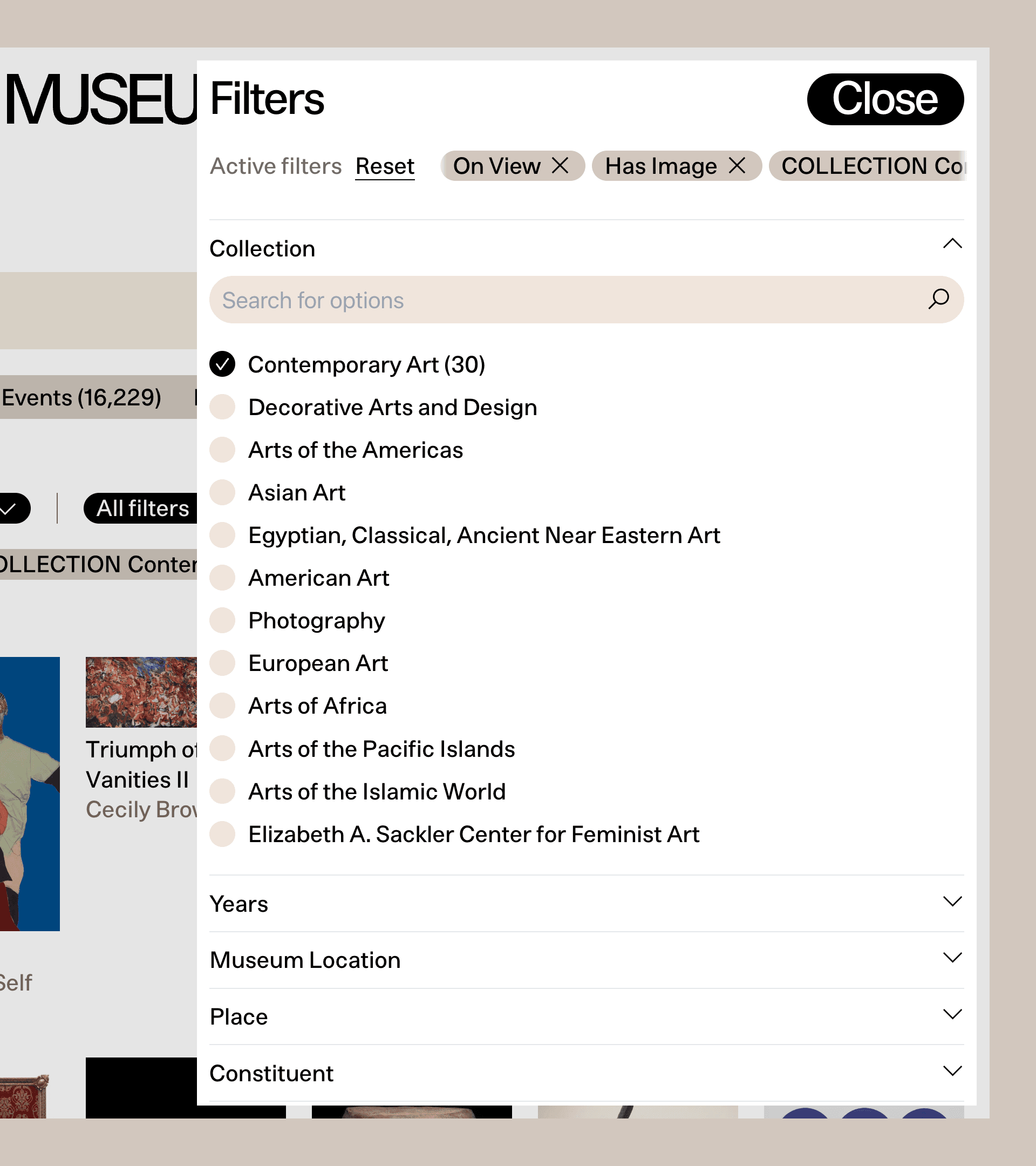
We created a collection editorial system that allowed both high-level and deep engagement with the institution's encyclopedic collection, such as highlighting general collection areas and making space for artworks grouped by theme, on top of a robust set of search and filter tools.
Throughout our engagement, we worked closely with more than a dozen internal staff departments—curators, front desk associates, content editors, audience strategists, and more—leading workshops and user testing to uncover the most intuitive navigation and direct our resources to the highest-impact features.
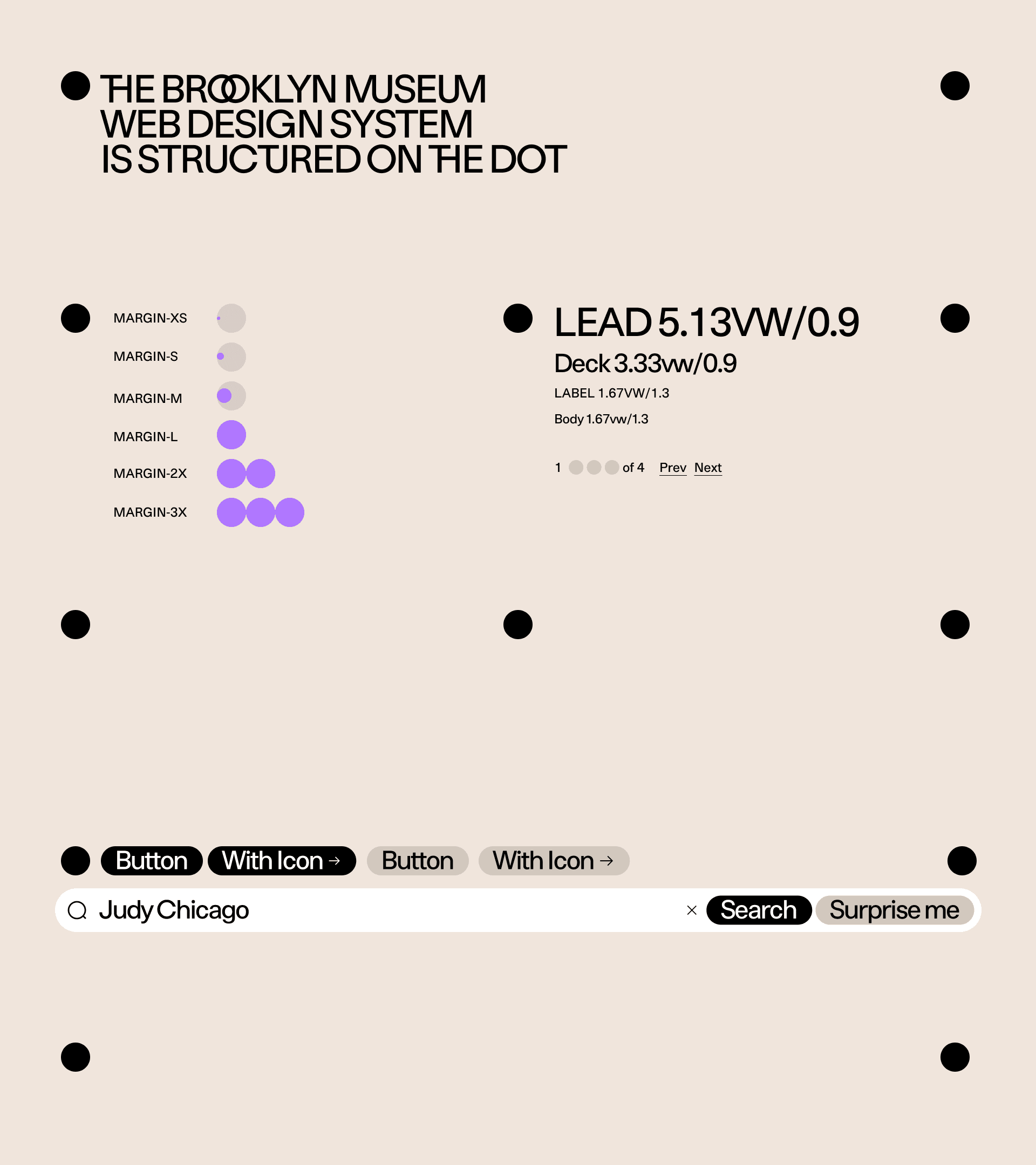
A flexible web design system, created in tandem with brand design studio Other Means and the internal graphic design team, unifies the digital experience, with a grid visually structured by the dot-based logo and graphic language, and including features like custom color theming giving the museum tools to continuously evolve its digital presence.